About client:
Pegas Transauto is a company specializing in international road freight and logistics across Europe and Asia Services: freight forwarding, customs clearance, warehousing, full transport cycle Fleet: trucks and trailers with 20–40 ton capacity, real-time GPS tracking Focus on safety, on-time delivery, and eco-friendly solutions (Euro-6 engines) Operating since 2015, partners include retailers, manufacturers, and e-commerce Tagline: “Flying over the roads”
Requirement:
Develop a memorable logo conveying dynamism, strength, and mythical grace, suitable for branded trucks, business cards, and digital channels, versatile for light and dark backgrounds.
Solution:
Core element — stylized pegasus with flowing wings integrated with the letter “P,” symbolizing takeoff and speed
• Two variants:
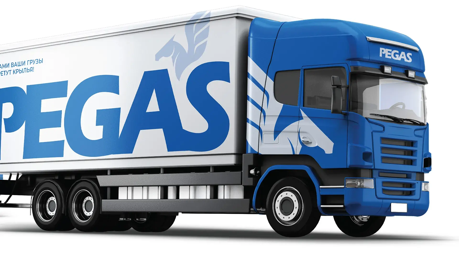
— On blue background (primary for trucks and ads) — blue evokes trust and sky
— Monochrome on white (for documents, labels, and light media)
• Font — modern sans-serif with dynamic slant for “PEGAS” and “transauto” below
• Scalable: from 5 cm on business cards to 3 m on truck sides
• Versatile: easily adapts to corporate identity — from stickers to website


