About client:
Little Care is a baby diaper brand focused on infant care Products provide comfort for the baby and convenience for parents Emphasis on high quality, hypoallergenicity, and natural materials Diapers designed with skin safety and gentleness in mind The brand positions itself as a caring assistant for young families Available in pharmacies, baby stores, and online platforms
Requirement:
Create a logo that conveys tenderness, trust, and care while remaining simple, memorable, and versatile for packaging, advertising.
Solution:
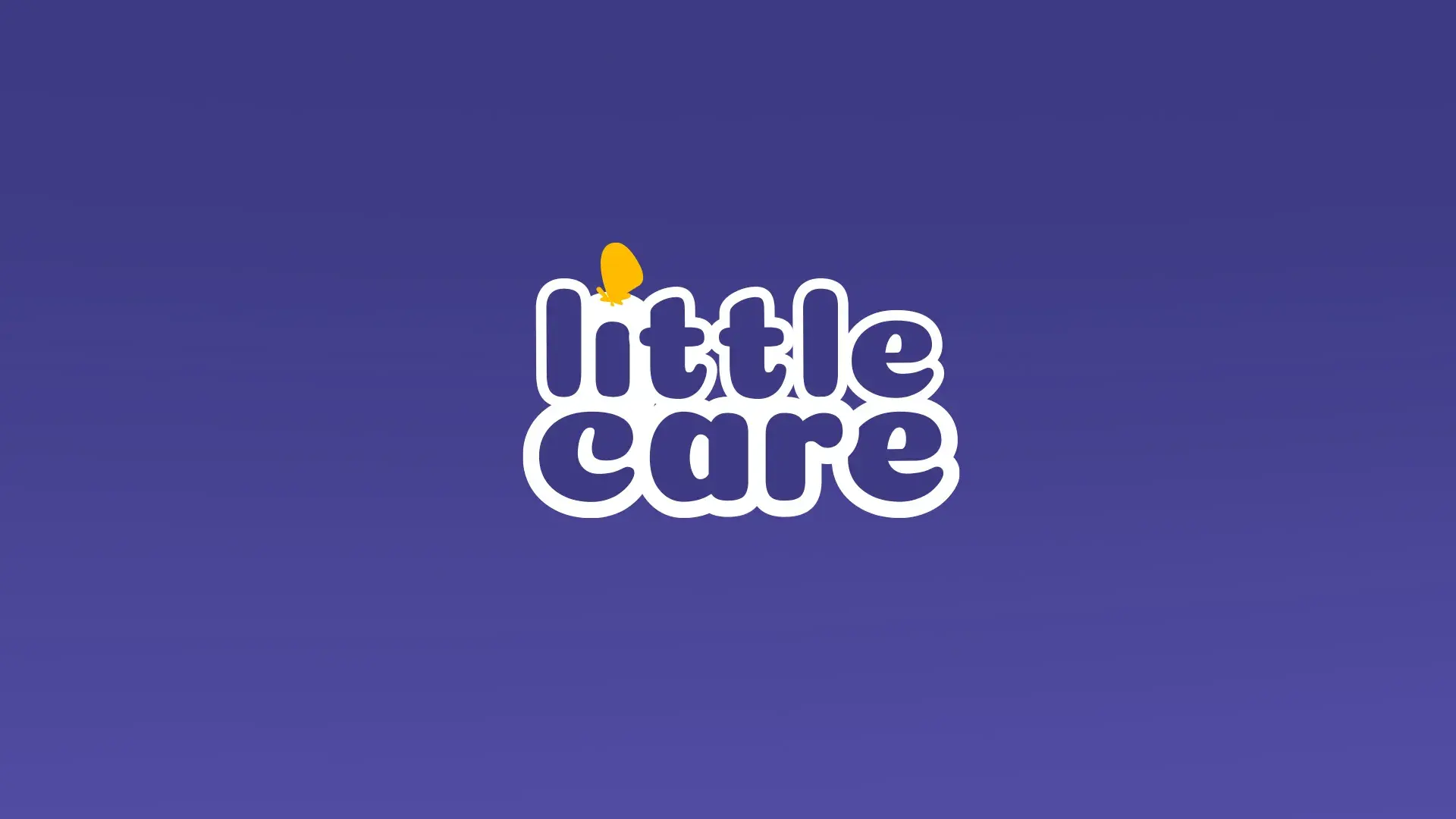
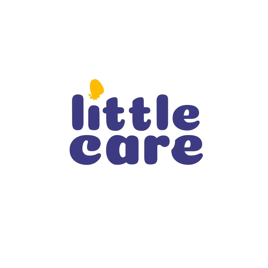
From the options, selected the version with a soft rounded font and a yellow butterfly above the “i” — symbolizing lightness, freedom, and childhood innocence
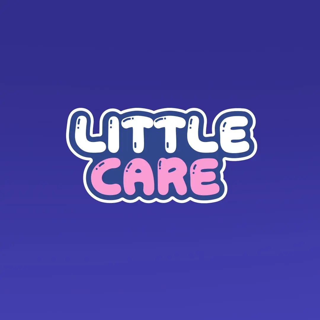
• Color palette: dark blue background and white text for a sense of calm and purity
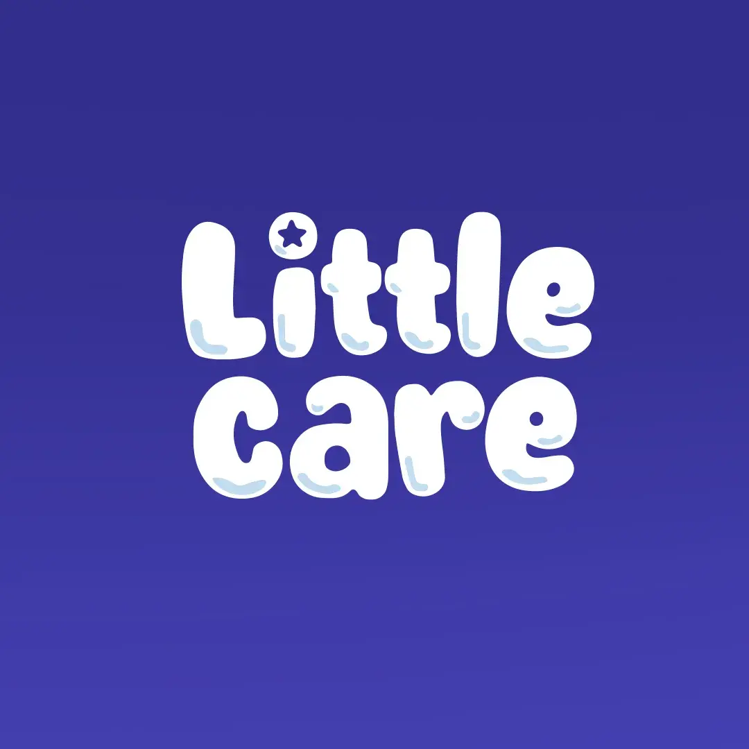
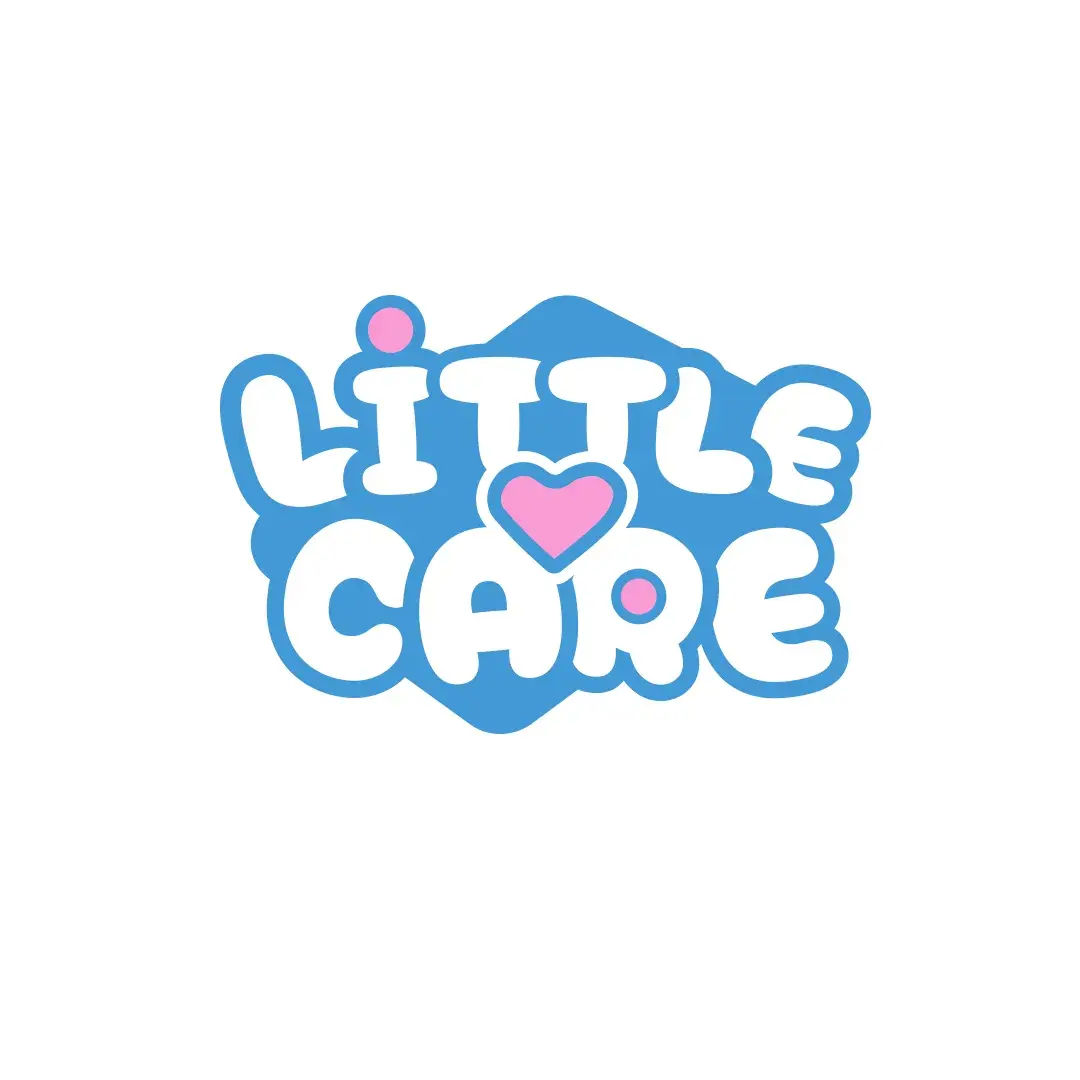
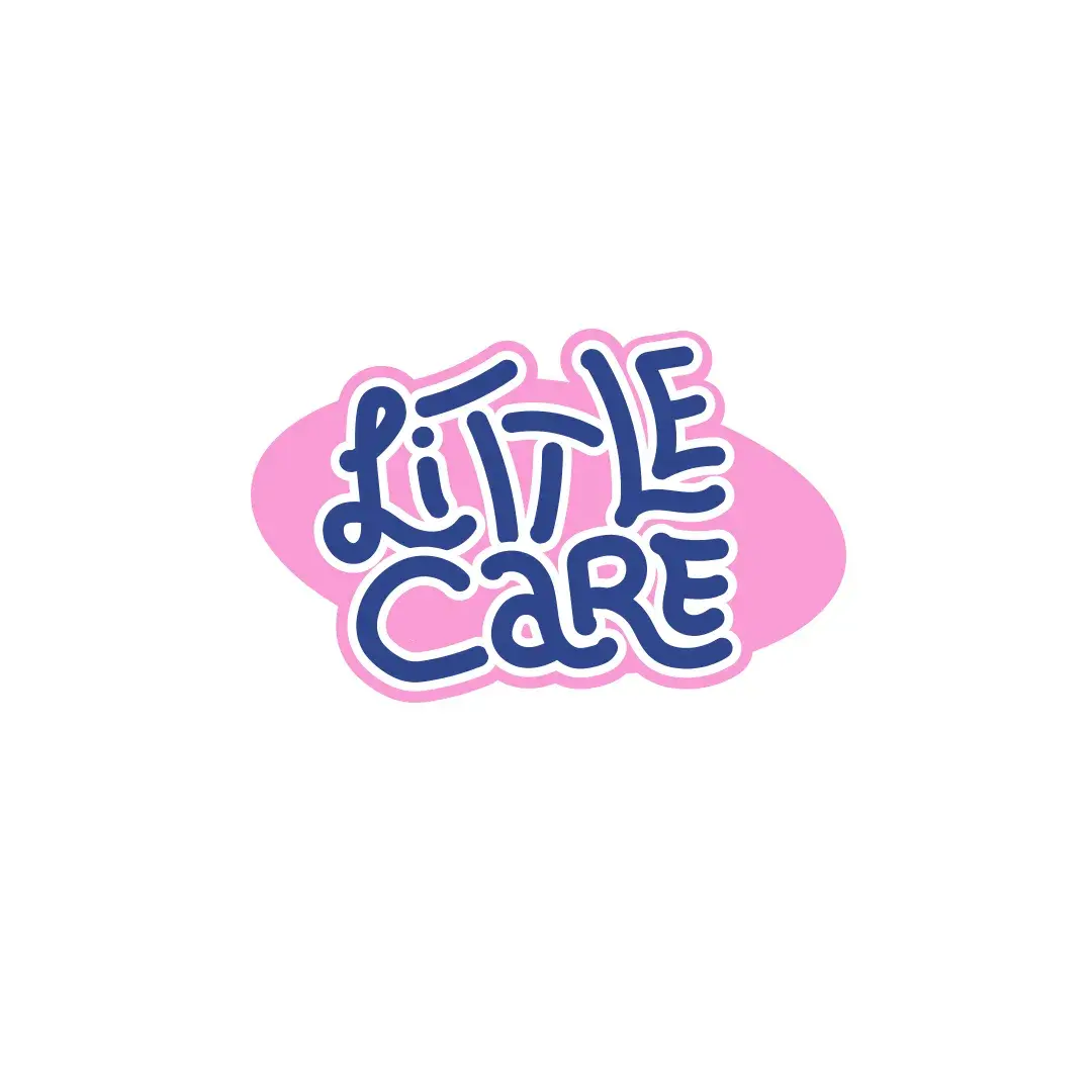
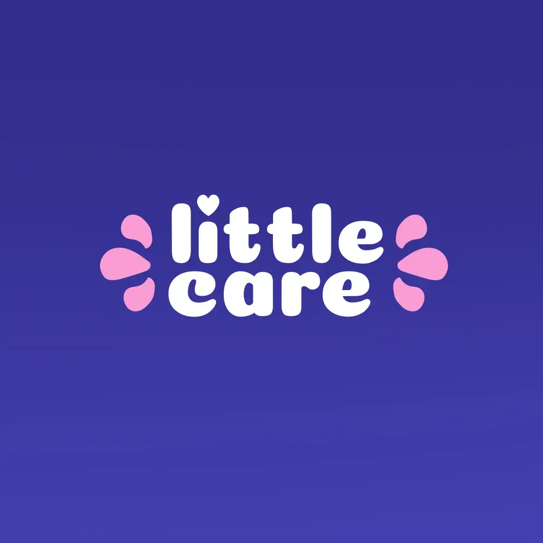
• Alternative variants included hearts, clouds, and a bird — to enhance the care theme
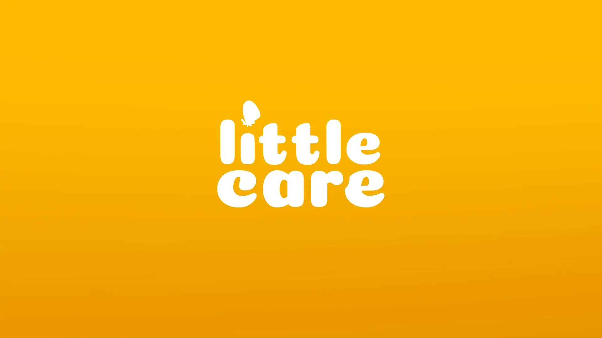
• Logo adapted for various media:
— Full version with butterfly (for packaging and banners)
— Simplified without icon (for small labels and favicon)
— Monochrome (for printing and engraving)
• Font with rounded edges reinforces the feeling of softness and safety
 Send Us Mail
 Call Us