About client:
Monolit Ural installs and services heavy industrial equipment, including cranes and lifting systems. A B2B provider focused on safety and uptime in high-stakes environments.
Requirement:
The client needed a bold, modern brand that screamed strength and reliability. The old look was dated, invisible in the market, and failed to match their scale. We had to build a visual system that works on paperwork, ads, heavy machinery, and merch.
Solution:
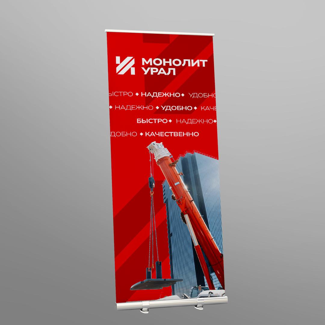
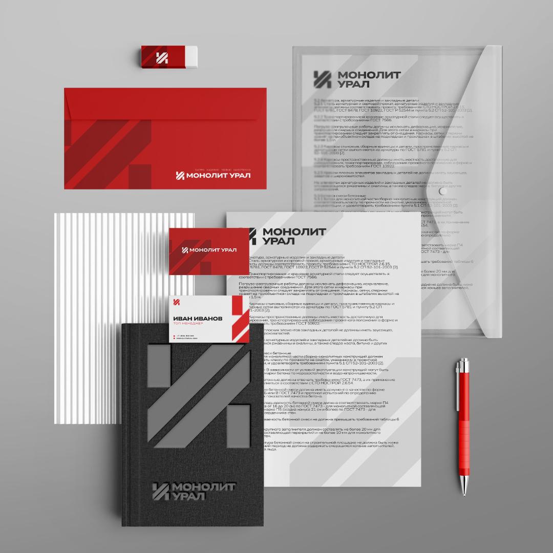
We built a full visual system where every piece reinforces power and precision:
• Logo: a sharp, motion-driven mark fusing a crane silhouette with a custom “M” in red-black.
• Colors: high-impact red for energy and safety; steel gray and black for authority.
• Graphics: angled lines and patterns drawn from structural beams and machinery flow.
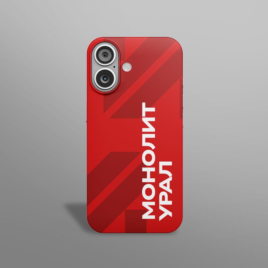
• Brand assets: templates for stationery, business cards, envelopes, notepads, ads, plus wraps for equipment and devices.
 Send Us Mail
 Call Us