Logo, color palette, and pattern refresh to create a friendly, modern, and versatile brand.

About client:

MEDSNAB is a manufacturer and distributor of medical equipment and related products, including wipes, diapers, and consumables. The company is also actively developing the children’s products market, offering items both under its own brands and through marketplace distribution.

Requirement:

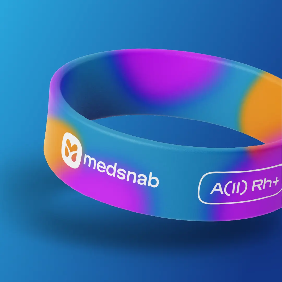
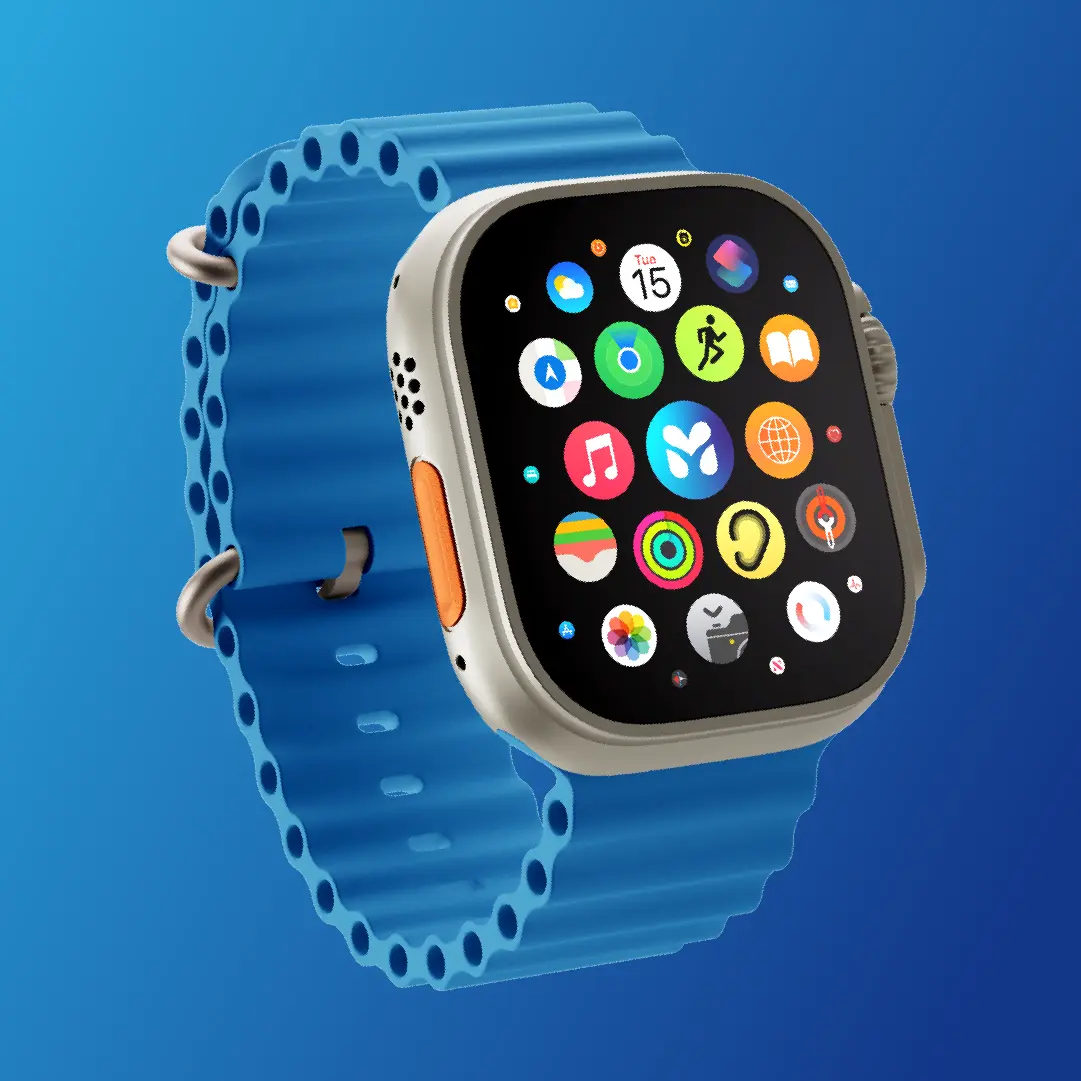
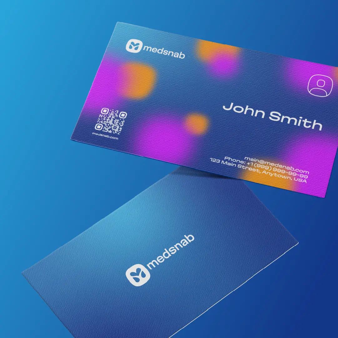
MEDSNAB, a major manufacturer of medical equipment and related products, faced the need to refresh its brand. The existing visual style was too “medical,” focused on the B2B segment, and did not create an emotional connection with the end consumer. With the company expanding into the children’s products market and selling on marketplaces, the brand needed to become versatile, modern, and adaptable for both B2B and B2C. The main goal was to maintain the trust of professional clients while making the brand more friendly, appealing, and emotionally engaging for parents and consumers of children’s products.

Solution:

We completely redesigned MEDSNAB’s visual identity to make the brand modern and versatile.


  • Logo: A minimalist logo was created with a favicon in the shape of a heart and a stylized “M,” symbolizing care and attention to the consumer.

  • Brand Colors and Patterns: New colors and graphic elements were developed that work equally well on both medical and children’s products.

  • Brand Elements: Additional visual elements were created for packaging, marketplaces, and promotional materials to ensure a cohesive and contemporary brand presence across all touchpoints.

As a result, the brand became versatile, friendly, and emotionally appealing while retaining the company’s professional and reliable image.

The new brand is versatile and modern, increasing the company’s appeal to B2C audiences. Products now feel more friendly and emotionally connected to consumers while maintaining the trust of B2B clients.

Contact Contact Contact Contact