Development of a corporate logo and visual identity for MasterRoad — a leading company in the field of chemical additives and engineering solutions for road construction.

About client:

MasterRoad specializes in developing, manufacturing and implementing advanced solutions for soil stabilization, cold recycling and transport infrastructure. The company combines engineering expertise, laboratory testing and project support from research through deployment.

Requirement:

Design a logo and visual style that reflect the engineering precision, technologic nature and reliability of a company operating in the B2B infrastructure segment. 

Solution:

The logo is based on a stylized road with a dynamic curve flowing into the letter “R,” symbolizing movement, reliability, and engineering precision


• The mark is executed in strict geometric forms, emphasizing stability and technology


• Blue color evokes trust, professionalism, and quality


• Logo versions developed:


  — Full horizontal (for letterheads and websites)


  — Icon version (for mobile apps and favicon)


  — Monochrome (for printing and engraving)


  — Color and inverted (for light and dark backgrounds)


• As part of the corporate identity:


  — Fonts selected: primary — clean sans-serif, accent — modern serif


  — Patterns created using road and gear elements


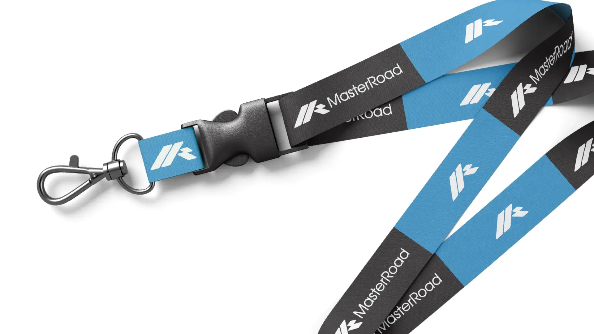
  — Templates designed for business cards, letterheads, presentations, and branded workwear


• The logo and style ensure visual consistency across all media — from equipment to digital channels

The new logo and corporate identity enabled MasterRoad to strengthen its image as a reliable technology partner Increased brand recognition among targeted clients Made company communications more professional and consistent Ensured visual integrity across all media — from heavy machinery to digital platforms Built greater trust among clients and partners through clear positioning Contributed to higher loyalty and market competitiveness

Contact Contact Contact Contact