About client:
Augustine Brewery is a craft brewery focused on natural ingredients and signature recipes Brews classic and experimental styles: from lagers to stouts with local ingredients Production blends centuries-old techniques with modern equipment The brewery participates in festivals, partners with bars, and develops its own taproom Augustine Brewery targets connoisseurs of rich flavor and beer culture
Requirement:
To create a visual identity that reflects the brand’s philosophy while emphasizing craftsmanship, attention to detail, and product uniqueness.
Solution:
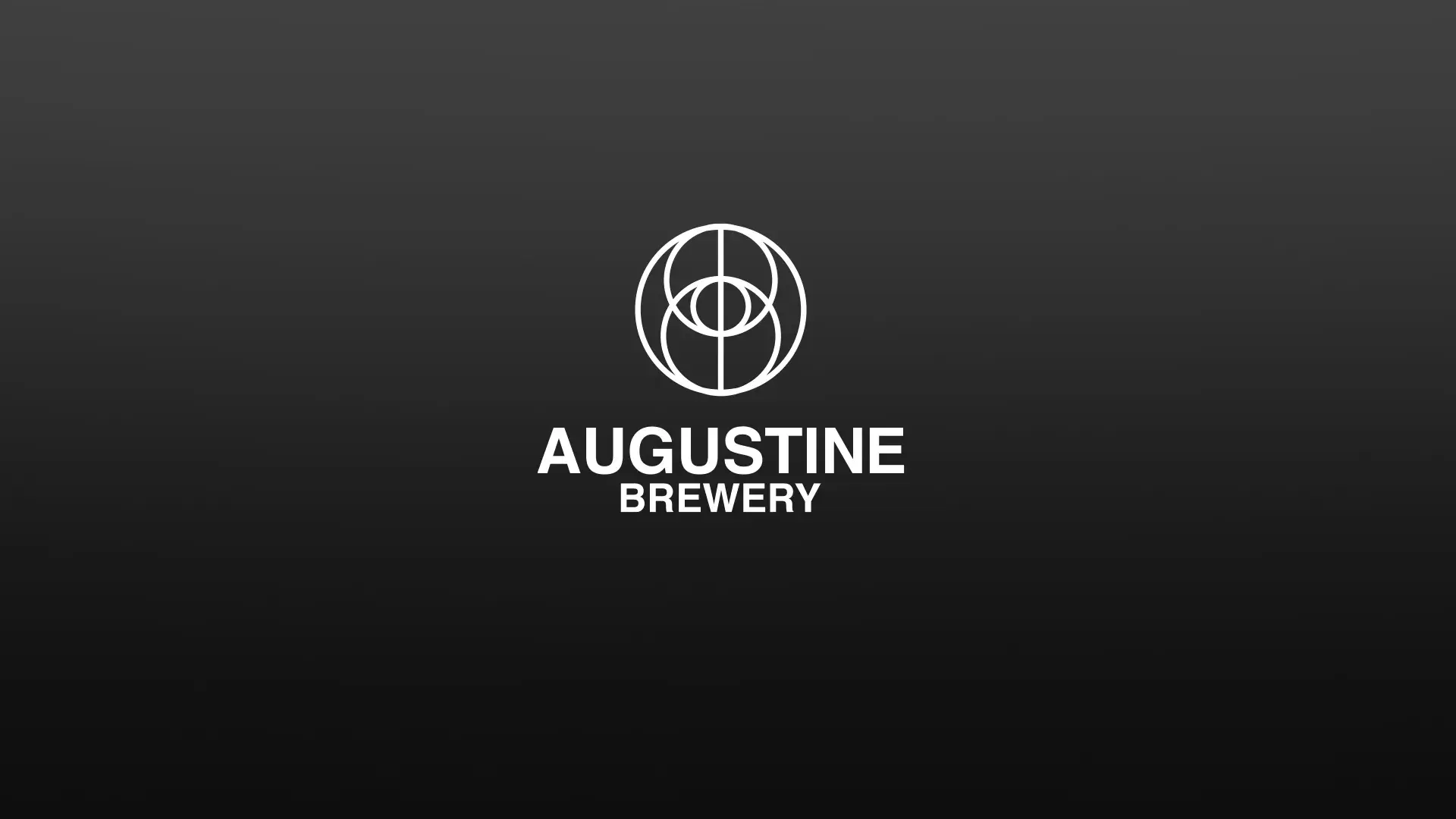
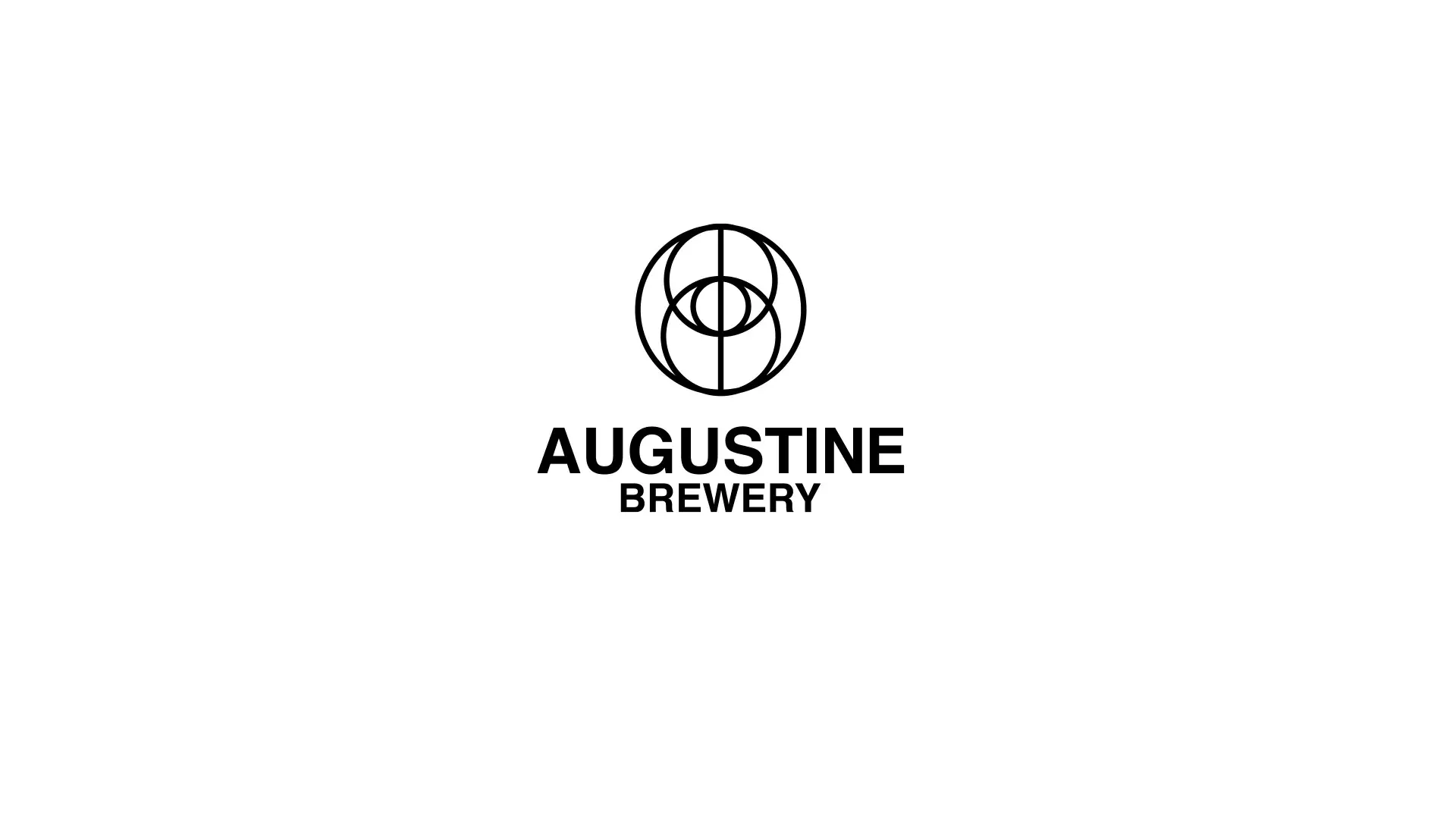
The mark consists of three intersecting circles symbolizing malt, hops, and water — the three pillars of beer
• A central vertical axis emphasizes flavor balance and stability
• Monochrome palette (black and white) conveys premium quality and versatility
• Logo versions developed:
— Full with name (for labels and signage)
— Icon-only (for bottle caps, pins, and favicon)
— Inverted on dark background (for menus and packaging)
• The logo scales effortlessly and remains crisp at any size.
 Send Us Mail
 Call Us